News
-bloc-digital.jpg)
Bloc partners with J Lawson Model Makers
We’re proud to announce a new business partnership with J Lawson Model Makers, specialists in precision-crafted physical models for industrial sectors.
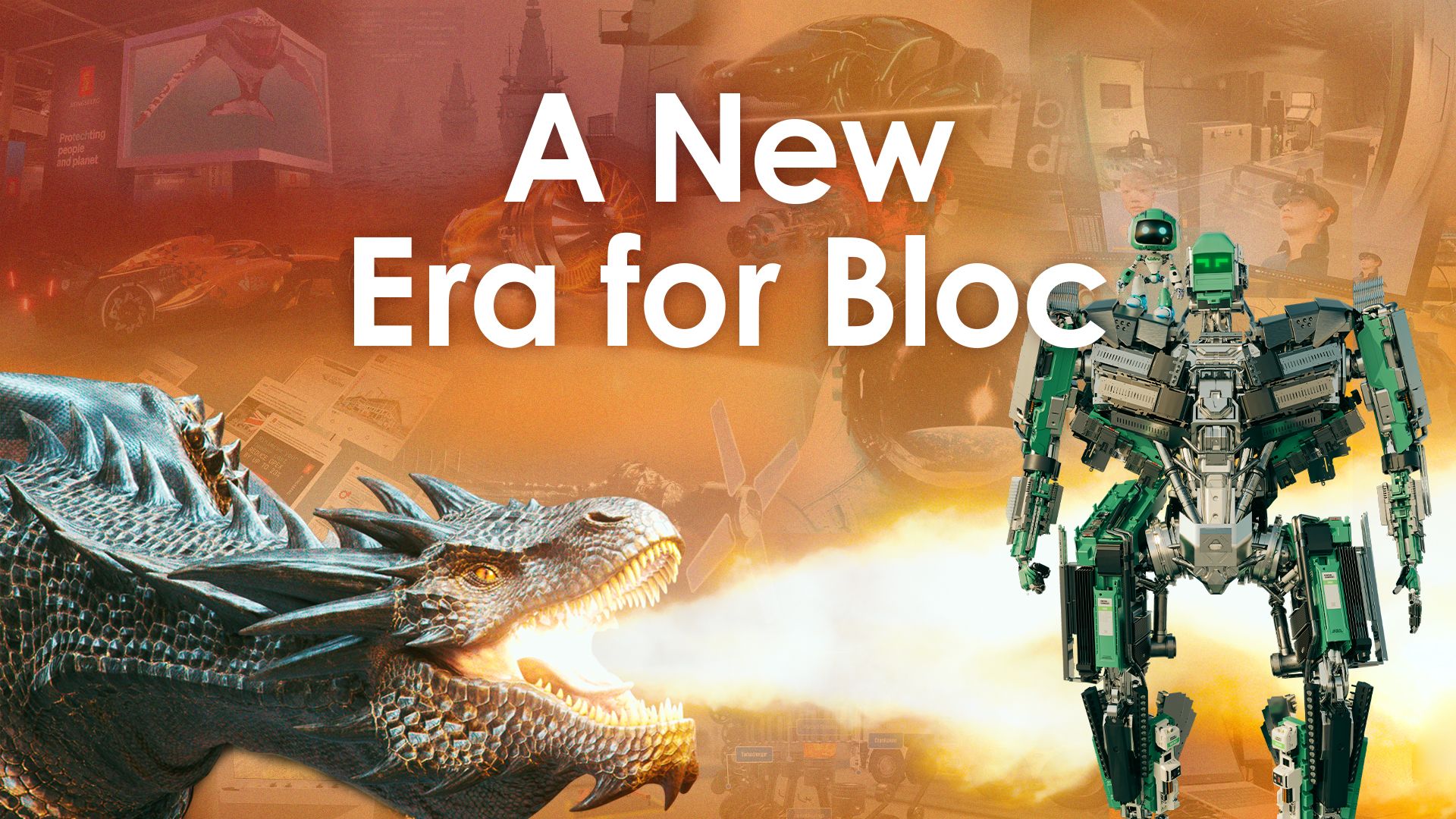
A New Era for Bloc
For 26 years, Bloc has helped industrial sectors navigate evolving challenges. Now, we're entering a new era of scalable services and SaaS products...
-bloc-digital.jpg)
A Year in Wichita: Building Bloc from the Air Capital of the World
As we mark one year since opening our Wichita office, Clare reflects on the journey so far…
-bloc-digital.jpg)
Roksana Completes Her Knowledge Transfer Partnerships (KTPs)
Our People Lead Roksana completed her Knowledge Transfer Partnership (KTP), a three-way partnership with Bloc, the University of Derby and Innovate UK.
-bloc-digital.jpg)
Bloc Takes on the London Marathon MyWay!
Our Blocees took on the iconic 26.2 miles in their own way, building team spirit and demonstrating the amazing things done Beyond Bloc across the local community!
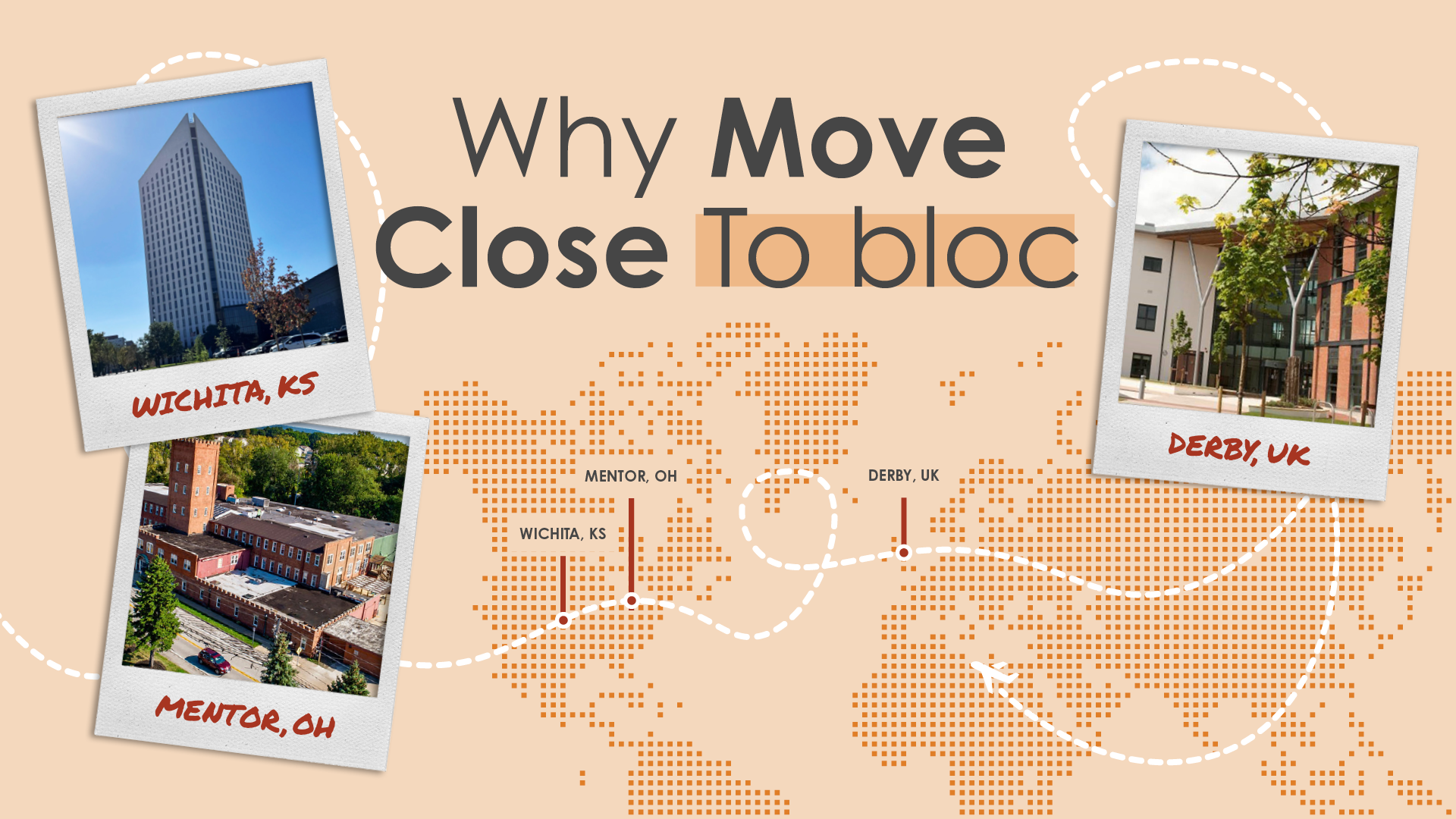
Cities of Opportunity: Why Move Closer to Bloc Digital?
What do our office locations do for your personal lives? Here’s a breakdown of what living in Derby, Ohio and Wichita can offer our Blocees.