News
-bloc-digital.jpg)
Bloc Wins People Development Award at Derby Business Awards
Award-Winning Culture: Bloc won in the Commitment to People Development category at the Derbyshire Business Awards 2026!
-bloc-digital.jpg)
IWD 2026: Give To Gain
Food, fun and one equal place of work were highlights of our International Women’s Day celebrations. Encouraging a mindset of generosity, collaboration, and reciprocity.

Bloc partners with Rotex Technologies for Sellafield Ltd
Bloc partners with Rotex Technologies to deliver a digital manufacturing study for Sellafield’s Final Assembly Line (FAL) for high-volume nuclear waste containers.

New Service Groups: Our 2026 Rebrand
We’re kicking off the new year by updating our services. Evolving how we present them, but not what drives them. Showcasing our solutions in a streamlined structure.

A View From The Top: What’s Next?
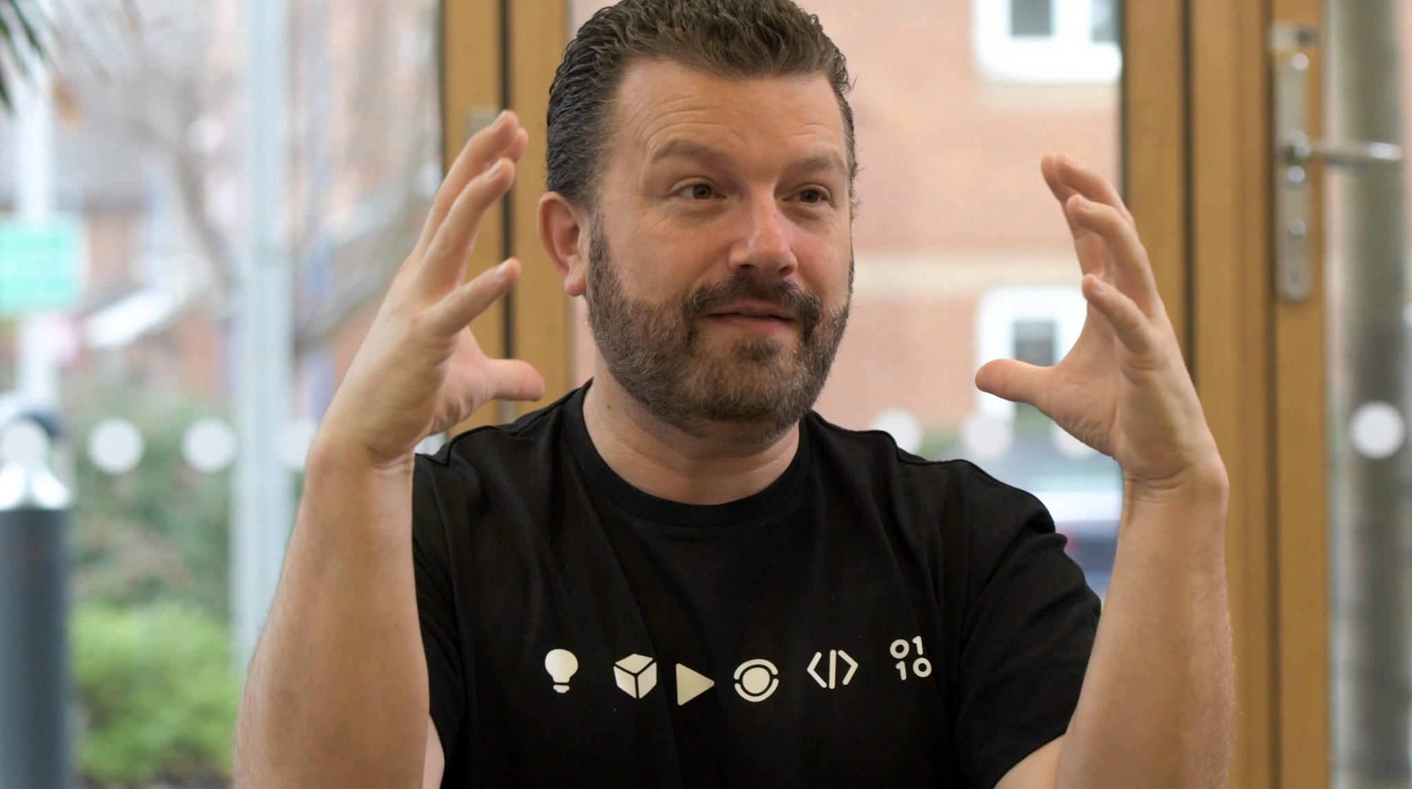
We sat down with Keith to film an exclusive director's interview outlining what 2026 has in store for Bloc...

2025: Our Year In Numbers
As we move into 2026, we’re reflecting on an amazing year at Bloc, sharing our favourite facts and figures from the past 12 months...


